Mastering Power BI: A Comprehensive Guide for Beginners
Contents
Introducing Power BI………………………………………………………………………. 3
Parts of Power BI………………………………………………………………………… 3
The flow of work in Power BI………………………………………………………. 4
Power BI Desktop:………………………………………………………………………….. 4
Power BI Desktop Interface: The Report has five main areas……………. 5
Querying Data from CSV…………………………………………………………………. 6
Query Editor……………………………………………………………………………….. 6
Exercise 1: Get Started with Query Editor………………………………………. 6
Exercise 2: Connecting the data from the Excel Source……………………. 7
Interface of Query Editor……………………………………………………………… 9
Exercise 3: Clean, Transform the data (Removing Nulls)……………….. 11
Calculated Measures Using DAX……………………………………………………. 13
Exercise 4: Creating of the Measures using DAX………………………….. 13
Exercise 5: Change the format of the Measures……………………………… 14
Creating Reports & Visualizations…………………………………………………… 15
Exercise 6: Creating your first visualization (Completion % of All Goals) Gauge Chart……………………………………………………………………. 15
Exercise 7: Importing a Theme to a Power BI Desktop File……………. 16
Exercise 8: Changing the Color of the Gauge………………………………… 17
Exercise 9: Changing the Title of the Gauge Chart………………………… 18
Exercise 9: Creating the Stacked Column Chart…………………………….. 19
Exercise 10: Sorting the Goals in the right order……………………………. 20
Exercise 10: Filters in Power BI 21
Introducing Power BI
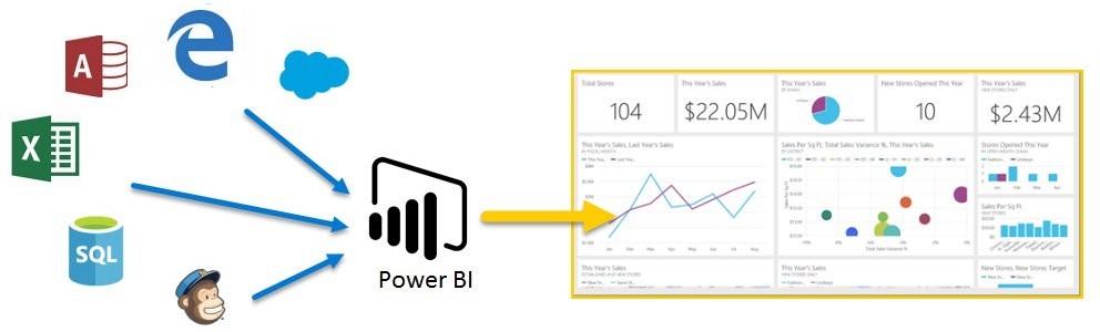
Power BI is a suite of business analytics tools which connects to different data sources to analyze data and share insights throughout your organization.
Parts of Power BI
There are 3 Parts of Power BI.
- Power BI Desktop
- Power BI Service
- Power BI Mobile
Power BI Desktop: It is a Windows desktop application (Report Authoring Tool) which Lets you build queries, models and reports that visualize data.
Power BI Service: Power BI Service is cloud based Software as Service Application which allows us to create dashboards, Setup schedule data refreshes, Share the reports securely in the organization.
Power BI Mobile: It is an application (App) on mobile devices which allows you to interact with the reports and dashboard from Power BI Service.
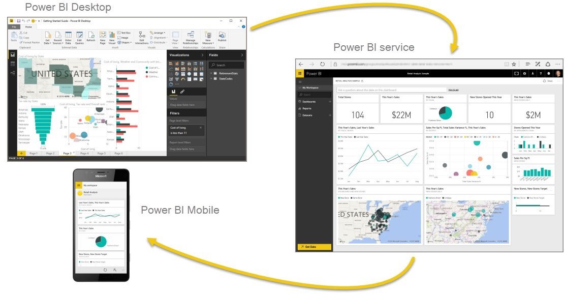
The flow of work in Power BI
A common flow of work in Power BI begins in Power BI Desktop, where a report is created. That report is then published to the Power BI service, and then shared so users of Power BI Mobile apps can consume the information.
It doesn’t always happen that way, and that’s okay, but we’ll use that flow to help you learn the various parts of Power BI, and how they complement one another.
Power BI Desktop:
Power BI Desktop is report authoring tool that allows you to create reports, queries, Extract Transform and Load the data from data sources and model the queries.
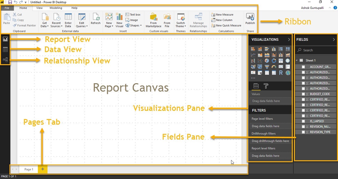
Power BI Desktop Interface: The Report has five main areas:
- Ribbon: The Ribbon displays common tasks associated with reports and visualizations;
- Pages: The Pages tab area along the bottom allows you to select or add a report page;
- Visualizations: The Visualizations pane allows you to change visualizations, customize colors or axes, apply filters, drag fields, and more;
- Fields: The Fields pane, allows you to drag and drop query elements and filters onto the Report view, or drag to the Filters area of the Visualizations pane;
- Views Pane: There are three types of views in the views pane
- Reports View – allows you to create any number of report pages with
- Data View – allows you to inspect, explore, and understand data in your Power BI Desktop
- Relationship or Model view – allows you to show all of the tables, columns, and relationships in your
Querying Data from CSV
Query Editor
You can import and clean data from Oracle while working in Power BI.
Query Editor, allows you to connect to one or many data sources, shape and transform the data to meet your business needs, then load the queries into the model into Power BI Desktop
This below step provides an overview of the work with data as well as connecting to data sources, shaping the data in Query Editor
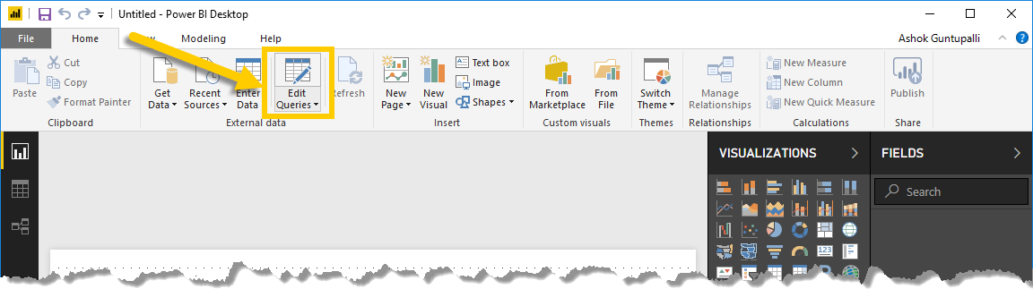
Exercise 1: Get Started with Query Editor
1. To get to Query Editor, select Edit Queries from the Home tab of Power BI
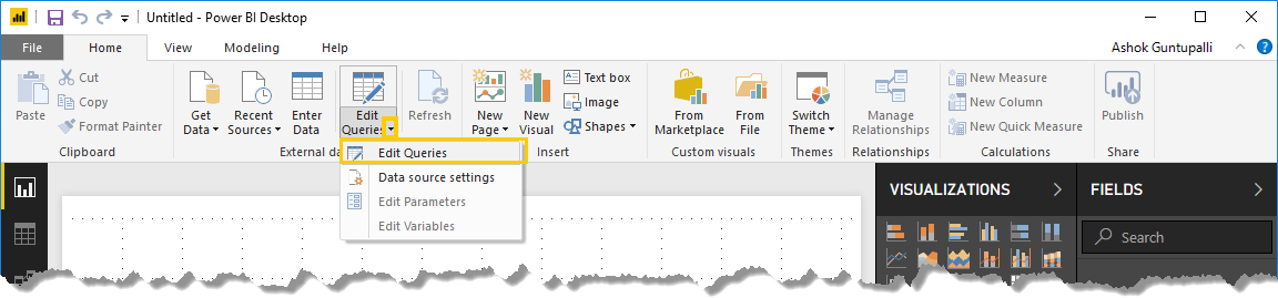
2. Click on the drop down of the Edit Queries on the bottom right corner, click on Edit Queries
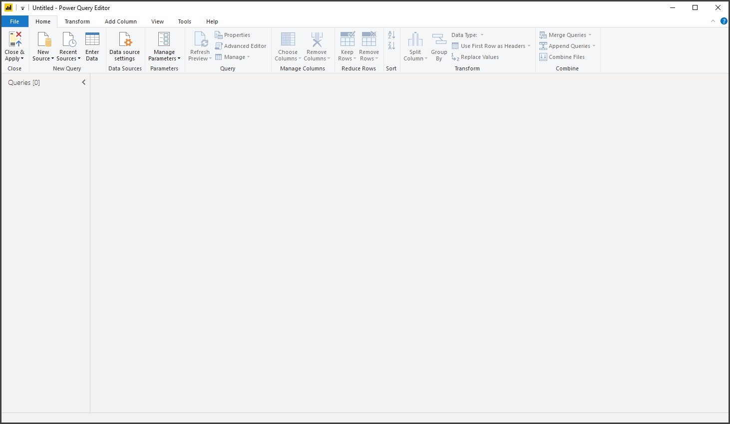
Note: With no data connections, Query Editor appears as a blank pane, ready for data.
3. Below image shows the interface of the Query Editor
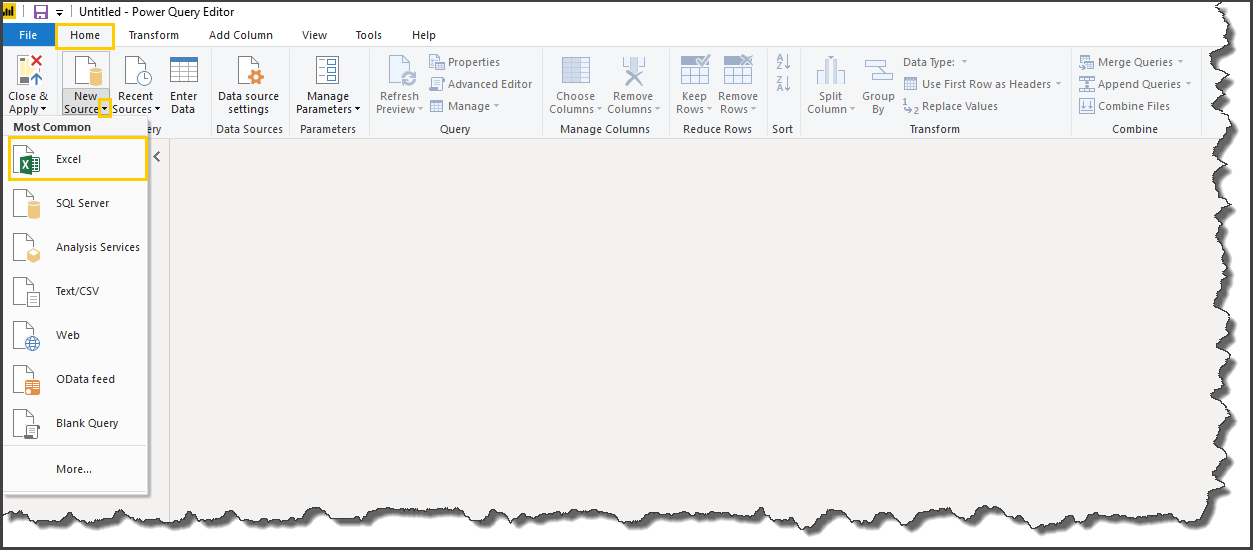
4. From Home tab > New Source > Choose Excel
Navigate to the Strategic Plan and Dashboard Folder and Choose
5. PowerBITraining_StrategicPlanDashboard_Input_Template Excel File
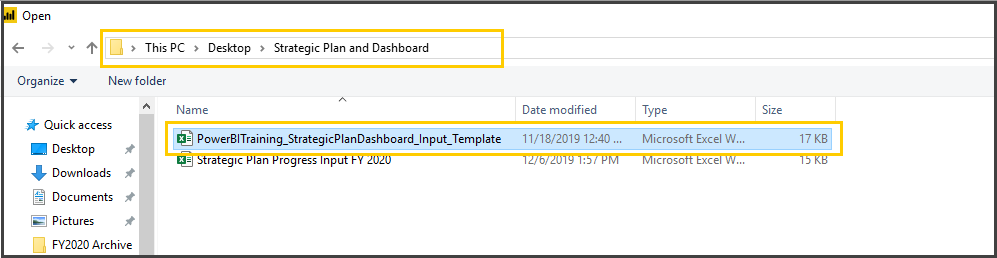
Click on Open ( ) at the bottom of the screen
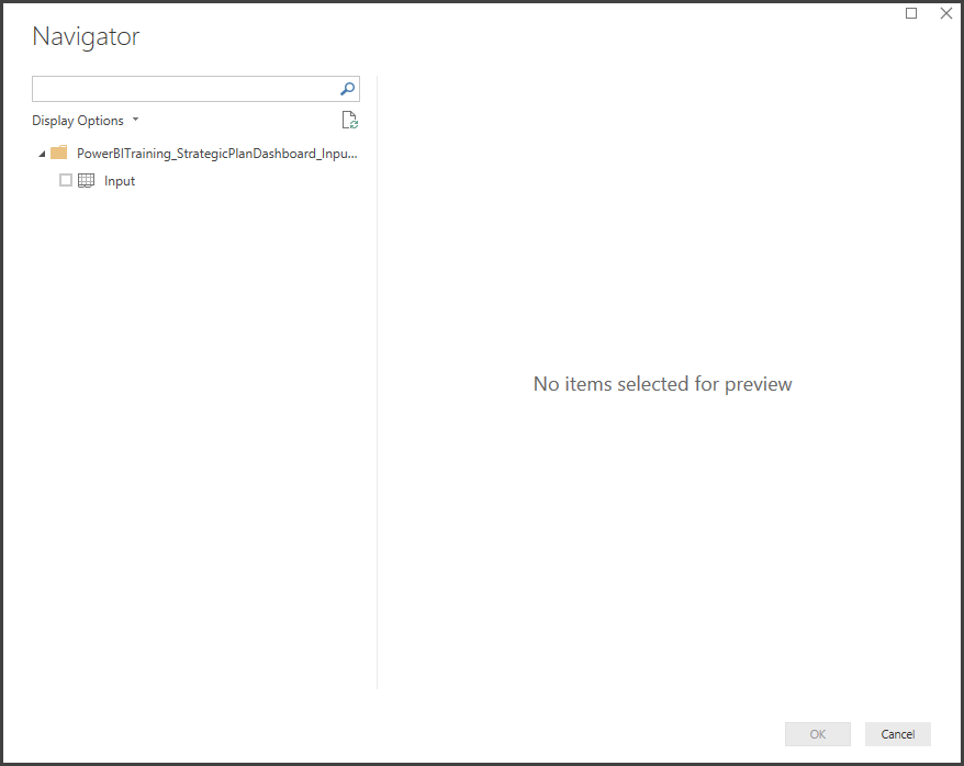
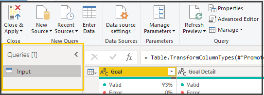
6. You can see a navigator screen to select the sheets on the Excel Workbook. In our case, we have one sheet named as Input
7. Select Input sheet from the available list
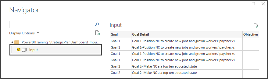
Click OK ( )at the bottom of the screen
Interface of Query Editor
Query Editor consists of 4 Parts
- Query Ribbon
- Left Pane
- Center (Data) Pane
- Query Settings
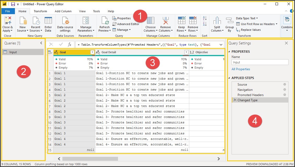
The Query Ribbon
The Ribbon in Query Editor consists of four tabs
- Home
- Transform
- Add Column
- View
Home Tab: The Home tab contains the common query tasks, including the first step in any query, which is Get Data.

Transform: The Transform tab provides access to common data transformation tasks, such as adding or removing columns, changing data types, splitting columns, and other data-driven tasks.

Add Column: The Add Column tab provides additional tasks associated with adding a column, formatting column data, and adding
custom columns. The following image shows the Add Column tab.

View Tab: The View tab on the ribbon is used to toggle whether certain panes or windows are displayed. It’s also used to display the Advanced Editor. The following image shows the View tab.

The Left pane:
The left pane displays the number of active queries, as well as the name of the query. When you select a query from the left pane, its data is displayed in the center pane, where you can shape and transform the data to meet your needs.
The center (data) pane:
In the Center pane, or Data pane, data from the selected query is displayed. This is where much of the work of the Query view is accomplished.
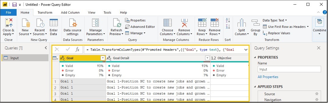
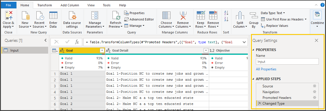
The Query settings pane:
The Query Settings pane is where all steps associated with a query are displayed.
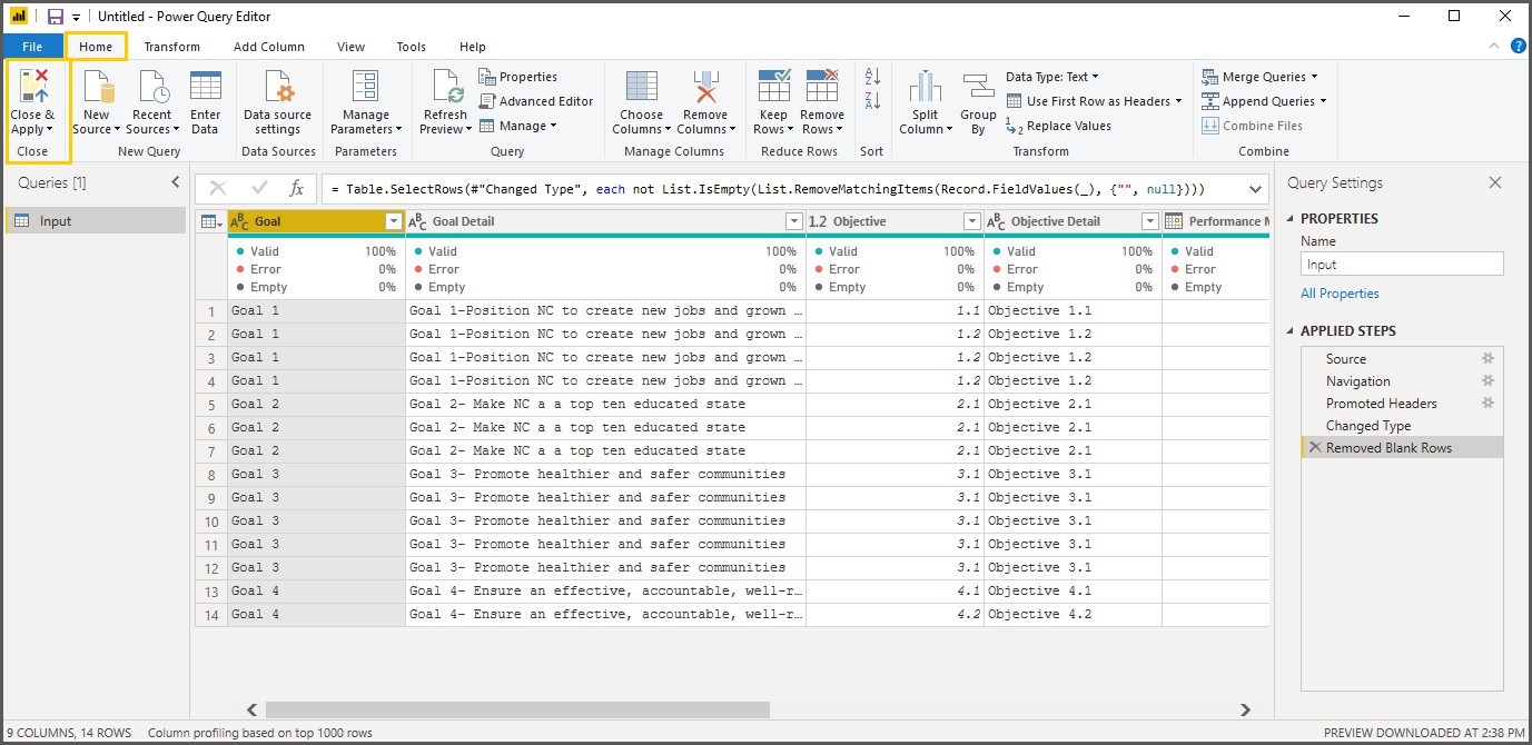
Exercise 3: Clean, Transform the data (Removing Nulls)
Removing the unwanted rows in the query.
8. Home Tab > Reduce Rows section > Remove Rows > Remove Blank Rows
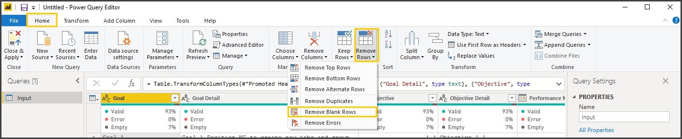
Notice that null records are eliminated, and new steps is added for the transformation you applied to the query in the query settings pane of the selected query.
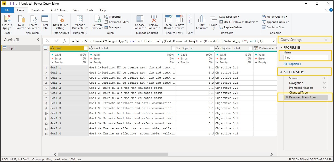
Note: Each step, you do in the Query Editor is recorded in Applied Steps of Query Settings pane.
9. From Home Ribbon > Click on Close & Apply
Note: After Close & Apply the query is added to the model for report development.
Calculated Measures Using DAX
In general, Measures are used to calculate aggregates, such as the sum or average of a column. Measures are calculated at the time of your query, which means that they aren’t stored in your database, but use processing power to execute a query at the time of your request.
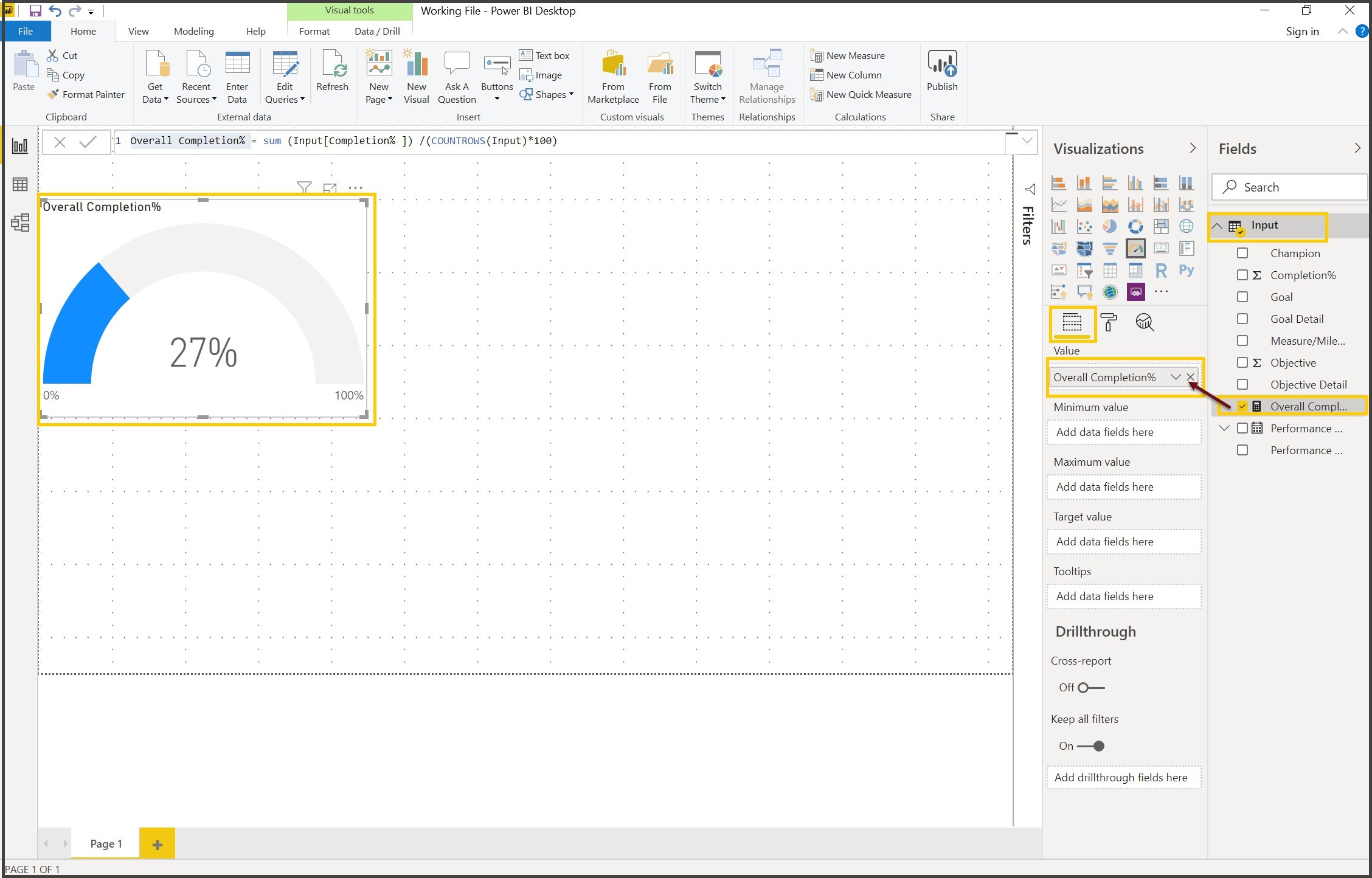
Exercise 4: Creating of the Measures using DAX
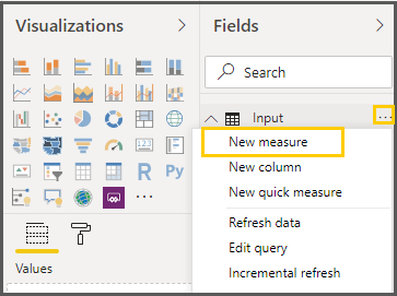
10. Be on the Report view, From the Fields Pane, click on the Ellipses (More options) of the Input Query, Click on New Measure.
11. In the Expression Bar, Type in
Overall Completion% = sum (Input [Completion%]) /(COUNTROWS(Input)*100)
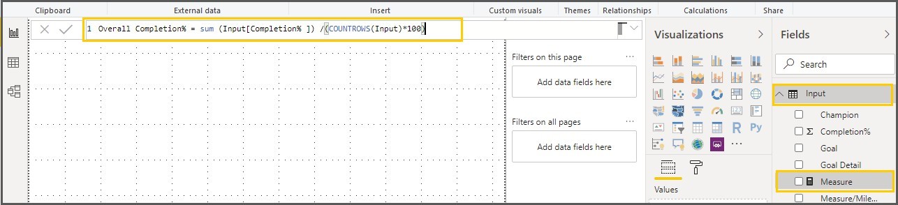
12. Click on Commit to validate the Expression
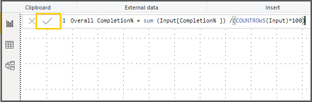
Note: After you commit, if there are any errors in the expression, the expression will be highlighted with red curly line.

Exercise 5: Change the format of the Measures
13. Expand Input query under Fields pane, Select Overall Completion %, and from the Modeling ribbon, Click on the Format under the formatting section and select Percentage.
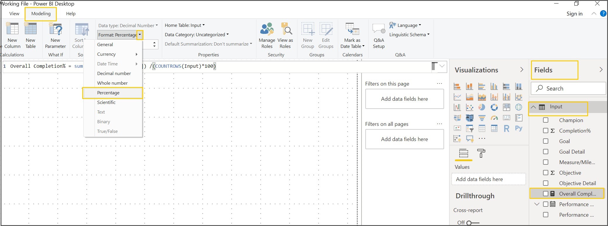
14. Make the decimal points to Zero of the Overall Completion % measure under formatting
Creating Reports & Visualizations
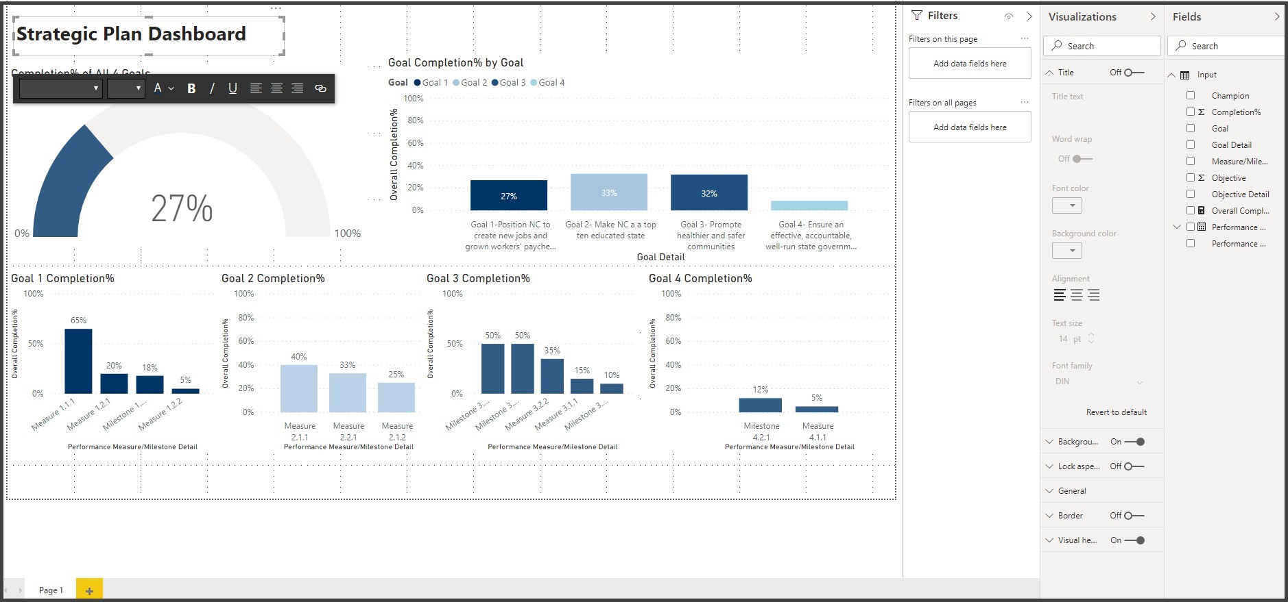
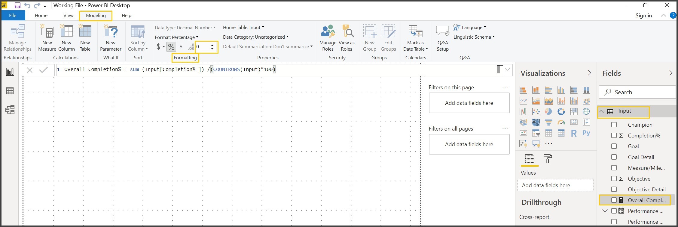
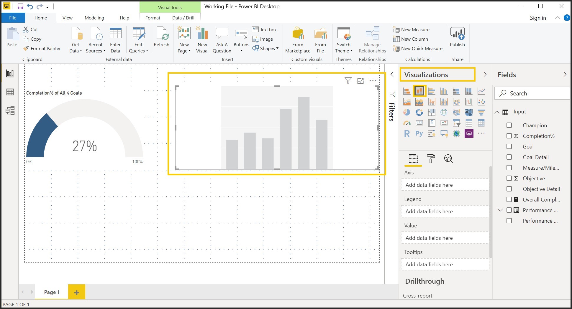
Exercise 6: Creating your first visualization (Completion % of All Goals) Gauge Chart
15. Click on Visualizations Pane and Click on Gauge Chart
Note: Make sure the Visualization is selected before dropping the fields.
16. Expand Input Query, Drag Overall Completion% to the Value section of the Fields pane of the gauge Visual
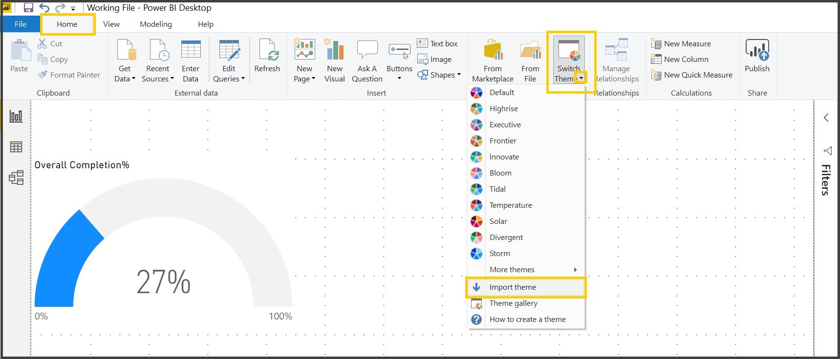
Exercise 7: Importing a Theme to a Power BI Desktop File.
With Report Themes you can apply design changes to your entire report, such as using corporate colors, changing icon sets, or applying new default visual formatting. When you apply a Report Theme, all visuals in your report use the colors and formatting from your selected theme.
17. From the Home Ribbon of the Report view, click on the drop down of the Switch Theme under Themes section and select Import from the Drag Overall Completion% to the Value section of the Fields pane of the gauge Visual
A window appears that lets you browse to the location of the JSON theme file
18. Navigate to the Strategic Plan and Dashboard folder o the Desktop and select Power BI Color Json file
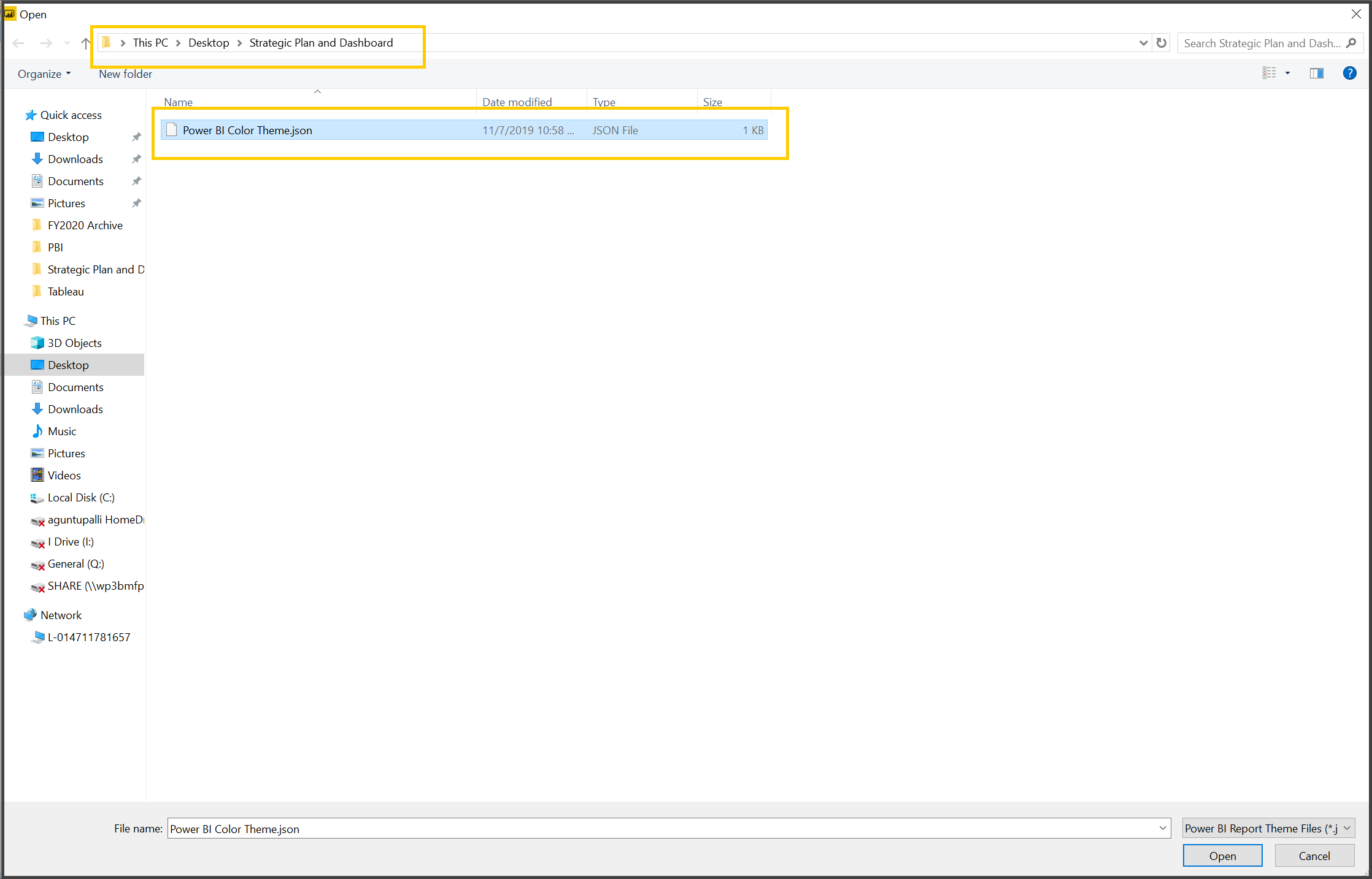
19. Click on Open ( ) at the bottom of the screen
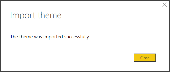
You will get a success message once the theme is imported successfully.
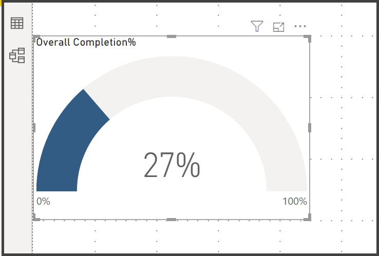
Exercise 8: Changing the Color of the Gauge.
20. Select the Gauge Chart and Click on the Format of the Gauge Chart, Expand Data Colors properties, click on the drop down of Fill property and select light blue color
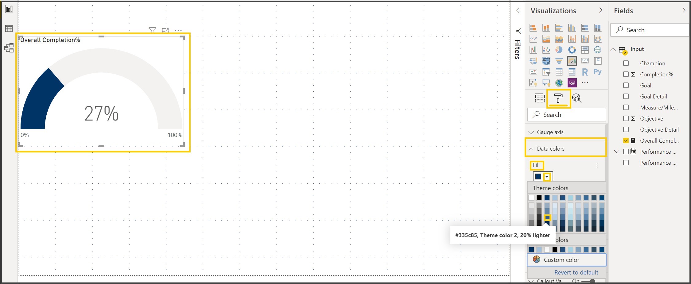
After the changing the color the gauge chart looks like the one below.
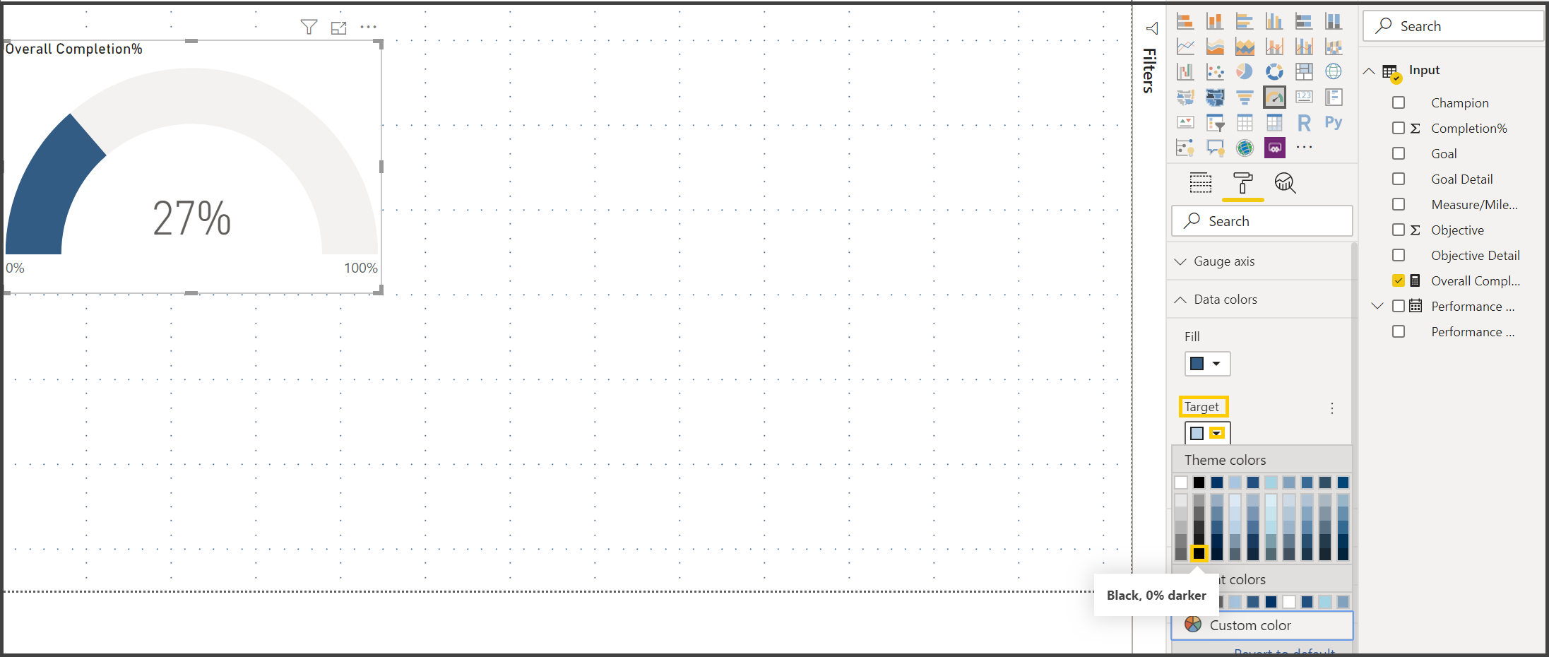
21. Click on the drop down of Target property and select Black
Exercise 9: Changing the Title of the Gauge Chart.
22. Expand the title property of the Gauge chart, Change the title text to “Completion% of All 4 Goals”.
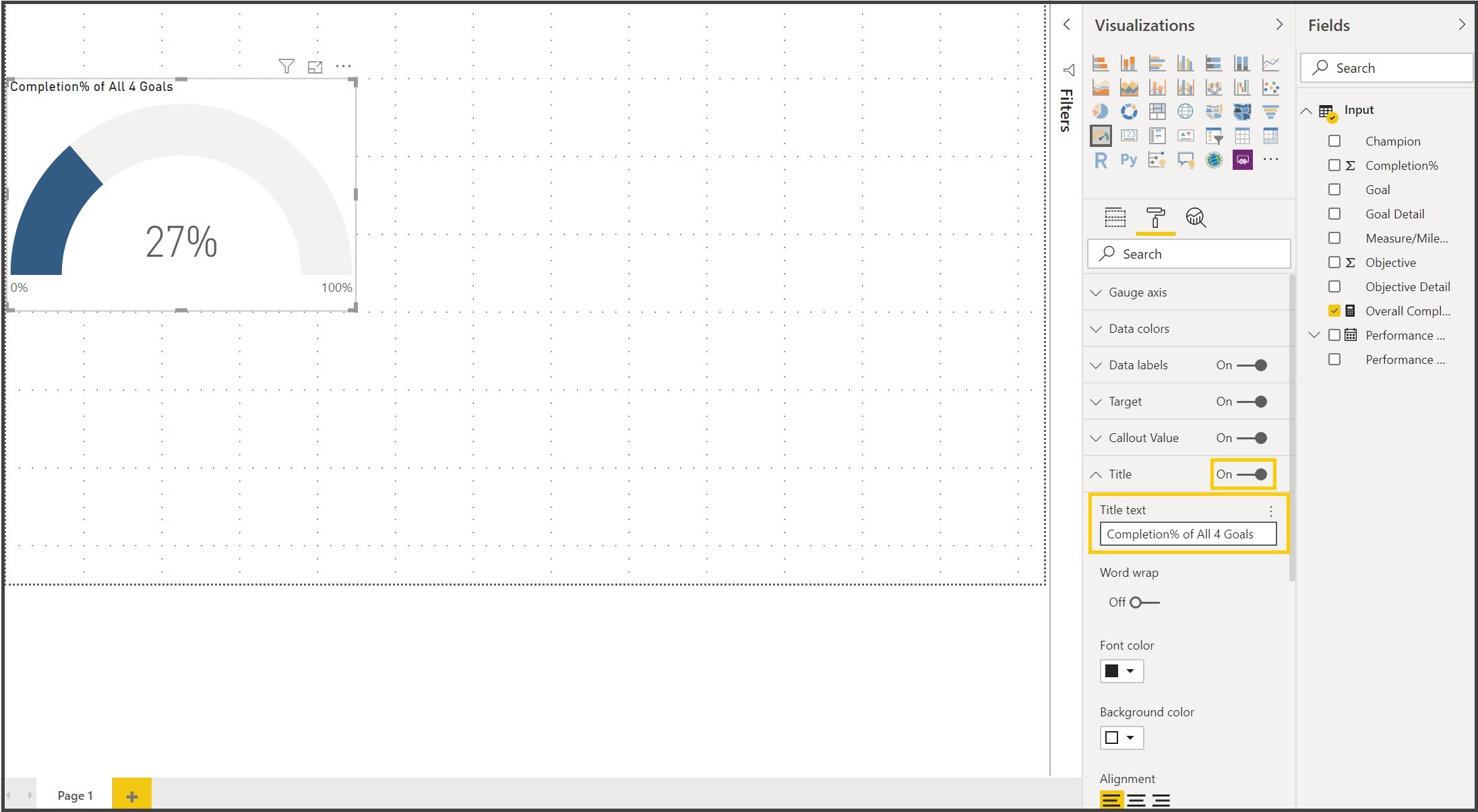
We are done with our first visualization. We will create few more visualizations.
Exercise 9: Creating the Stacked Column Chart.
23. Click anywhere on the Canvas other than the visuals, select Stacked Column Chart and bring the visual next to the Donut Chart.
24. Expand Input, Drag Overall Completion% to the Value section, Goal Detail to the Legend, Goal to the Axis of the Fields pane of the Stacked Column Visual.
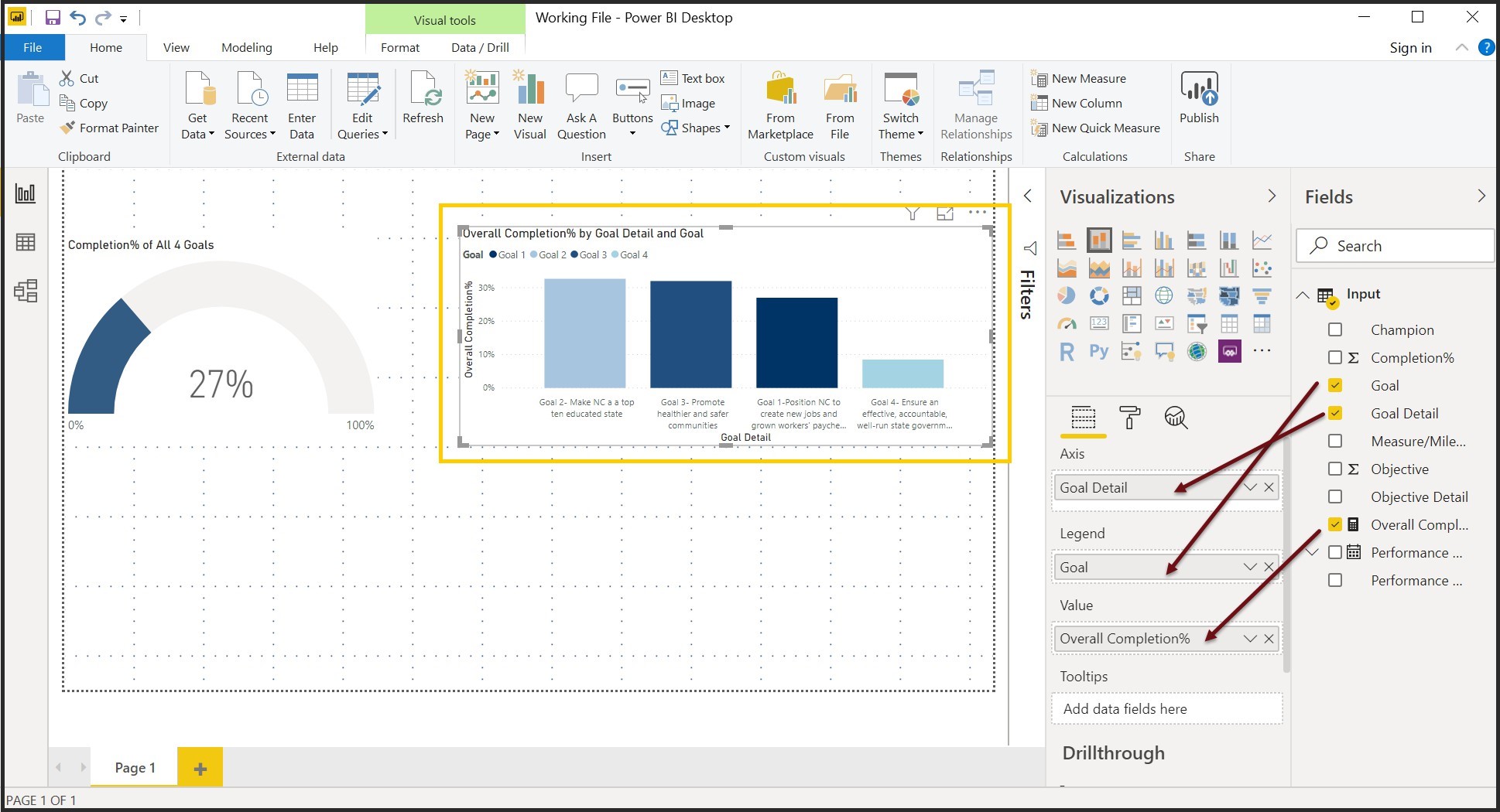
Notice that the goals are not in the right order.
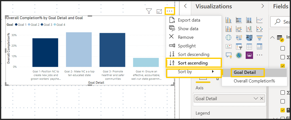
Exercise 10: Sorting the Goals in the right order.
25. Click on the ellipses ( More Options) of the Stacked Column Visual, Select Sort Ascending, Hover on Sort by and Select Goal Detail.
26. Click on the format icon () for the visual, Expand Title and edit the title to “Goal Completion% by Goal”
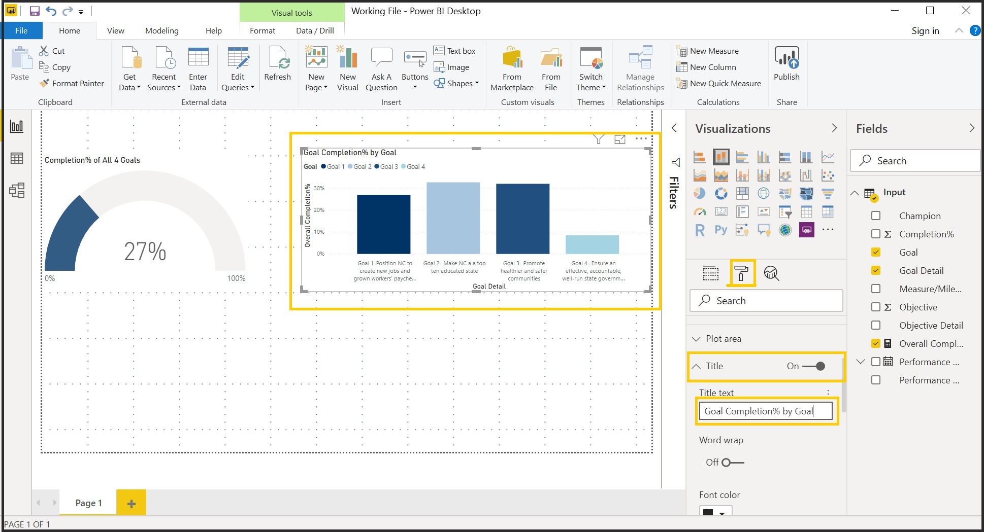
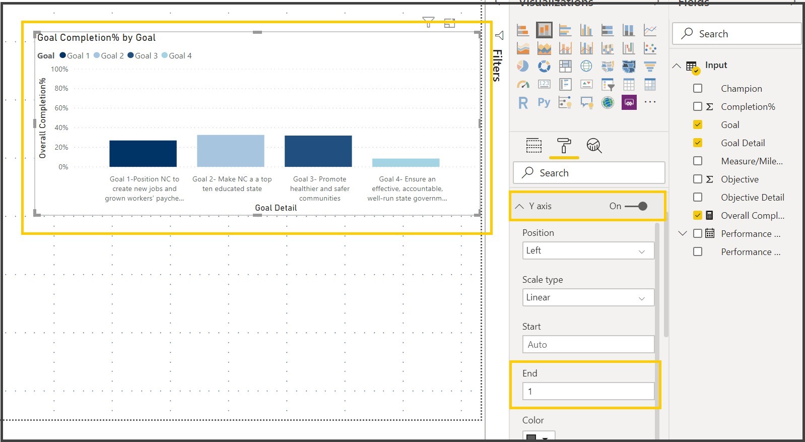
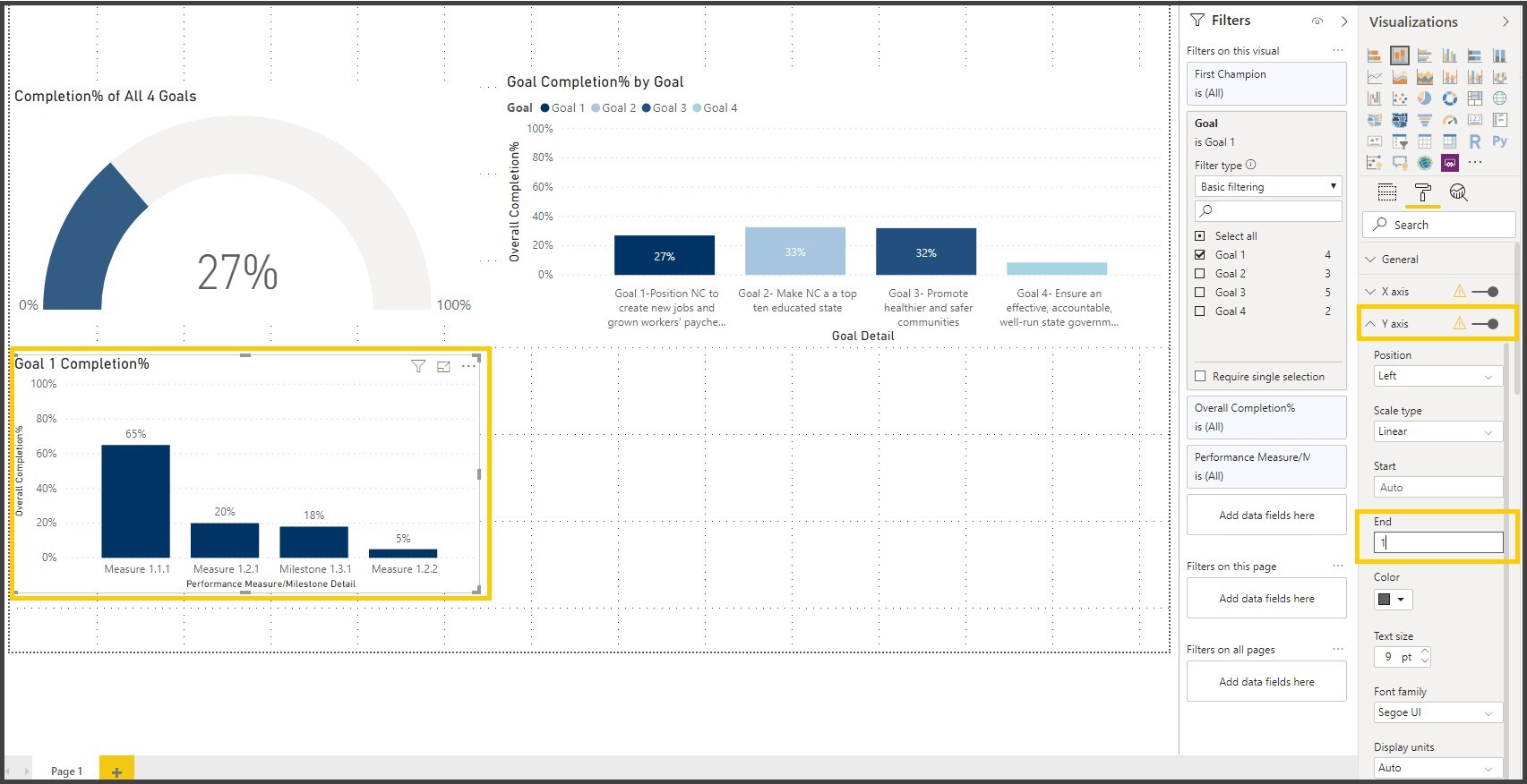
Notice that the Y axis is not 100%
27. Expand Y Axis property, In the End Box, Type in 1
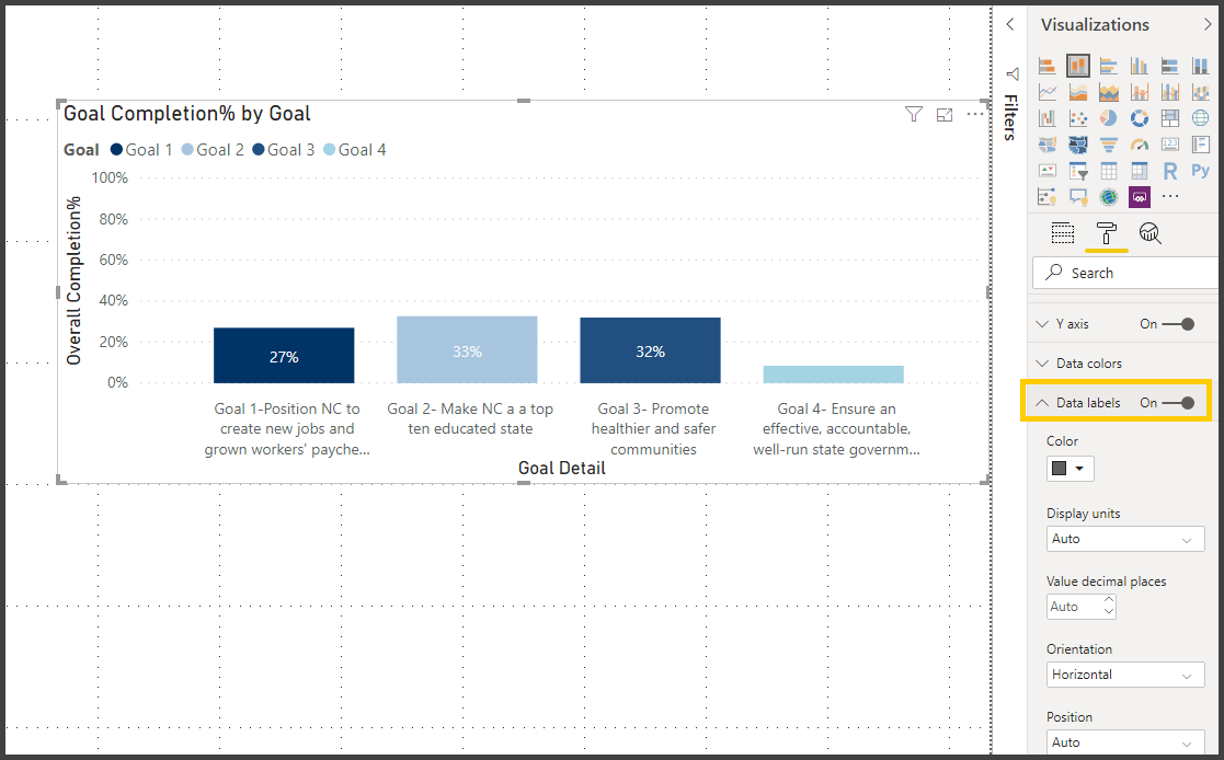
28. Turn on the Data Labels
29. Click anywhere on the Canvas other than the visuals, select Stacked Column Chart and bring the visual below the Donut Chart.
30. Expand Input, Drag Overall Completion% to the Value section, Performance Measure/Milestone Detail to the Axis, Champion to the tool tip of the Fields pane of the Stacked Column Visual.
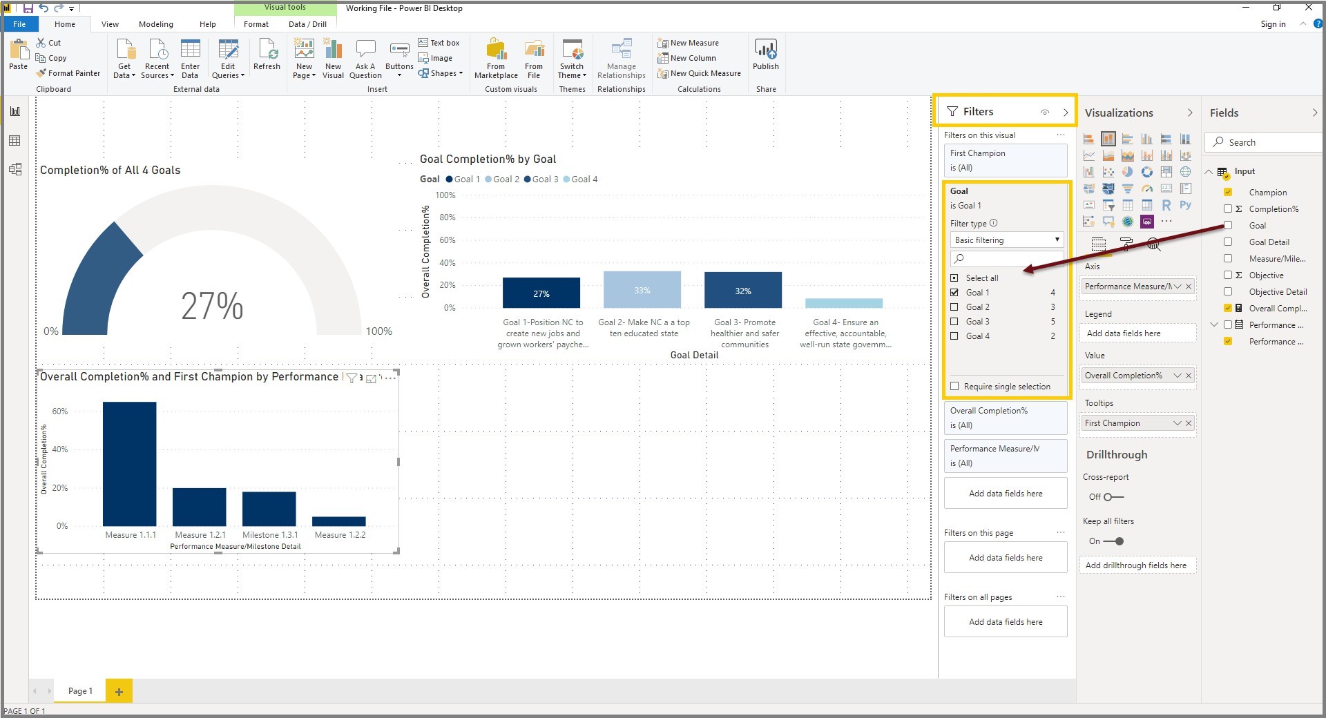
Exercise 10: Filters in Power BI

Filters allows the Power BI visual to narrow down or filter to the desired result. We are filtering the visual to show just the data for Goal.
31. Expand the filters pane, Drag Goal to the “Add data fields here” section under Filters on this visual section and select Goal 1
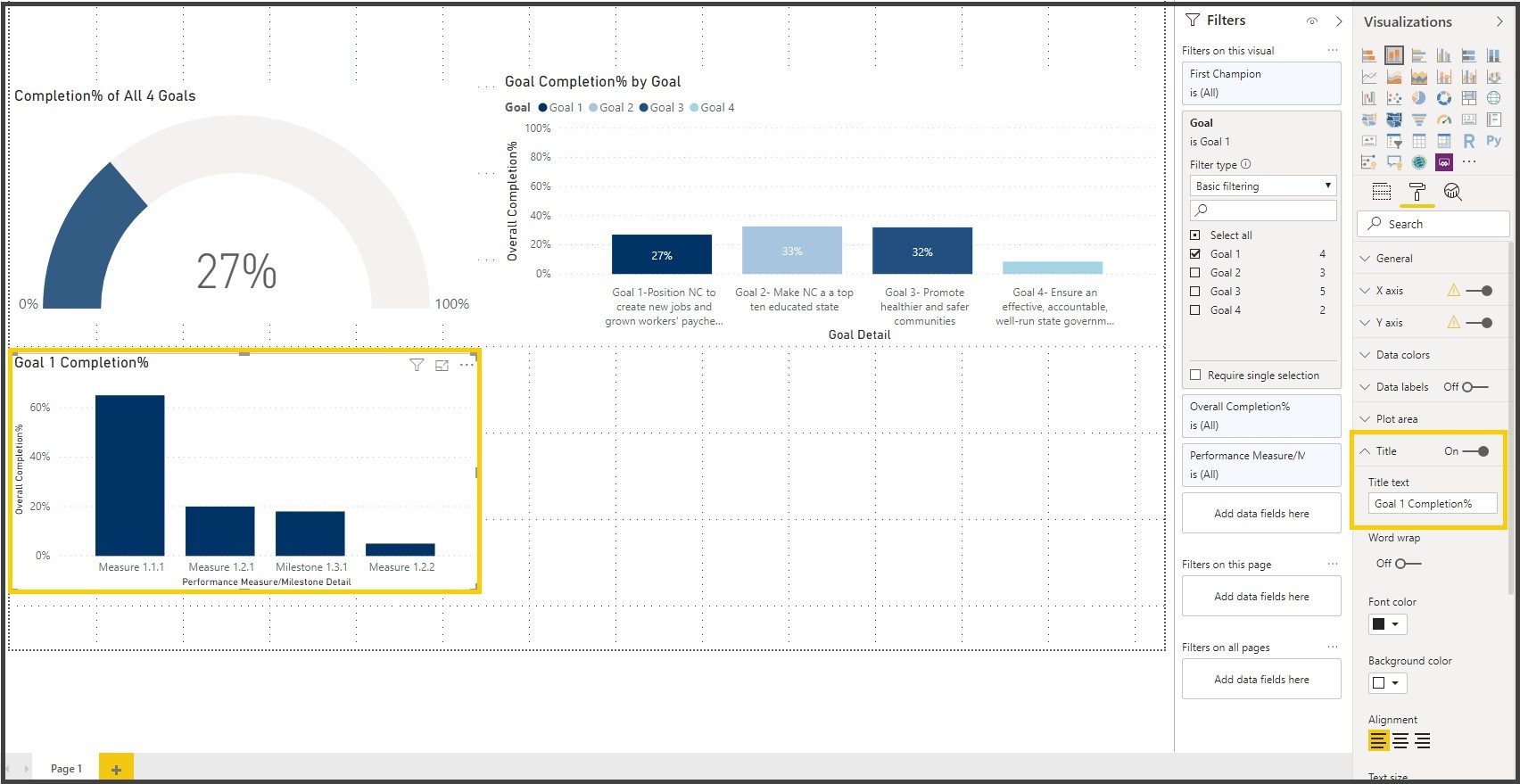
32. Click on the format icon ( ) for the Stacked Column Chart visual, expand Title and edit the title to Goal 1 Completion%
33. Turn on the Data Labels Property, Expand Y axis Property and in the End box Type 1
Adjust the height and width of the visual.
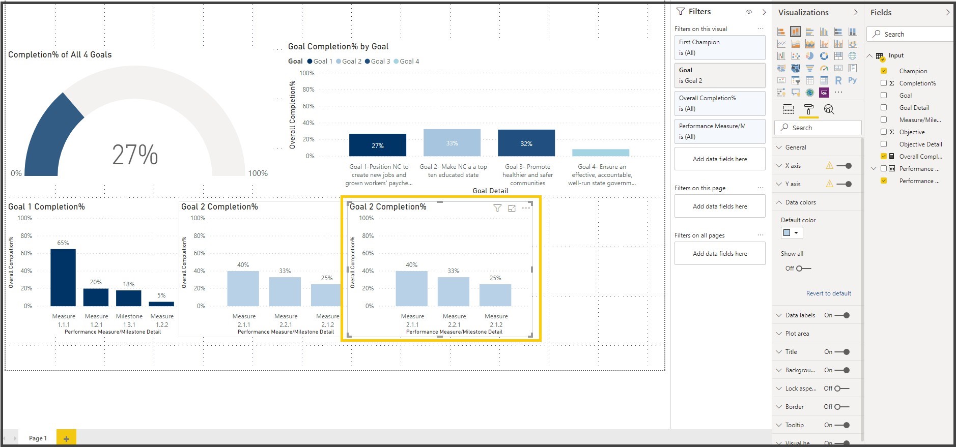
34. Click on the Stacked Column Chart visual and copy & paste it, Adjust the position on the Report page
Note: It is like MS word Copy (Ctrl + C) and Paste (Ctrl + V)
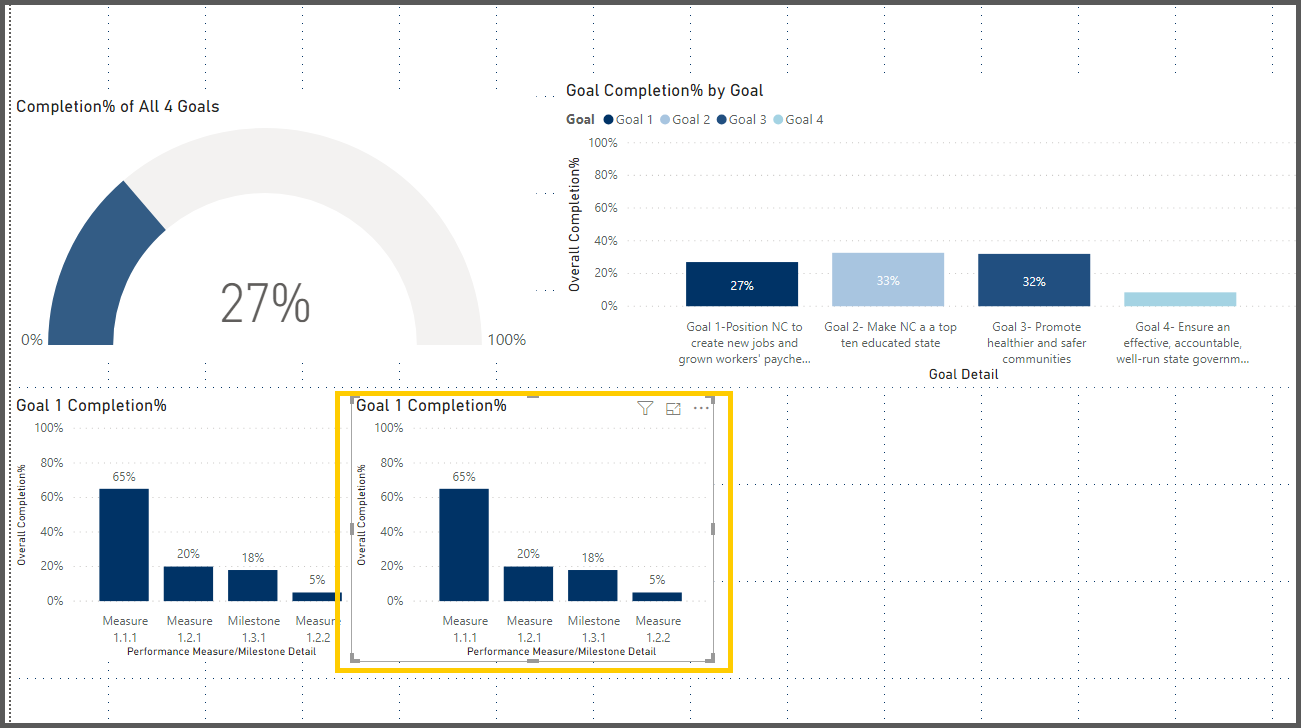
35. Click on the format icon () for the Stacked Column chart visual, expand Title and edit the title to Goal2 Completion %
![]()
36. Expand the filters pane, click on the drop down of the Goal Filter on Filters Pane and select Goal 2
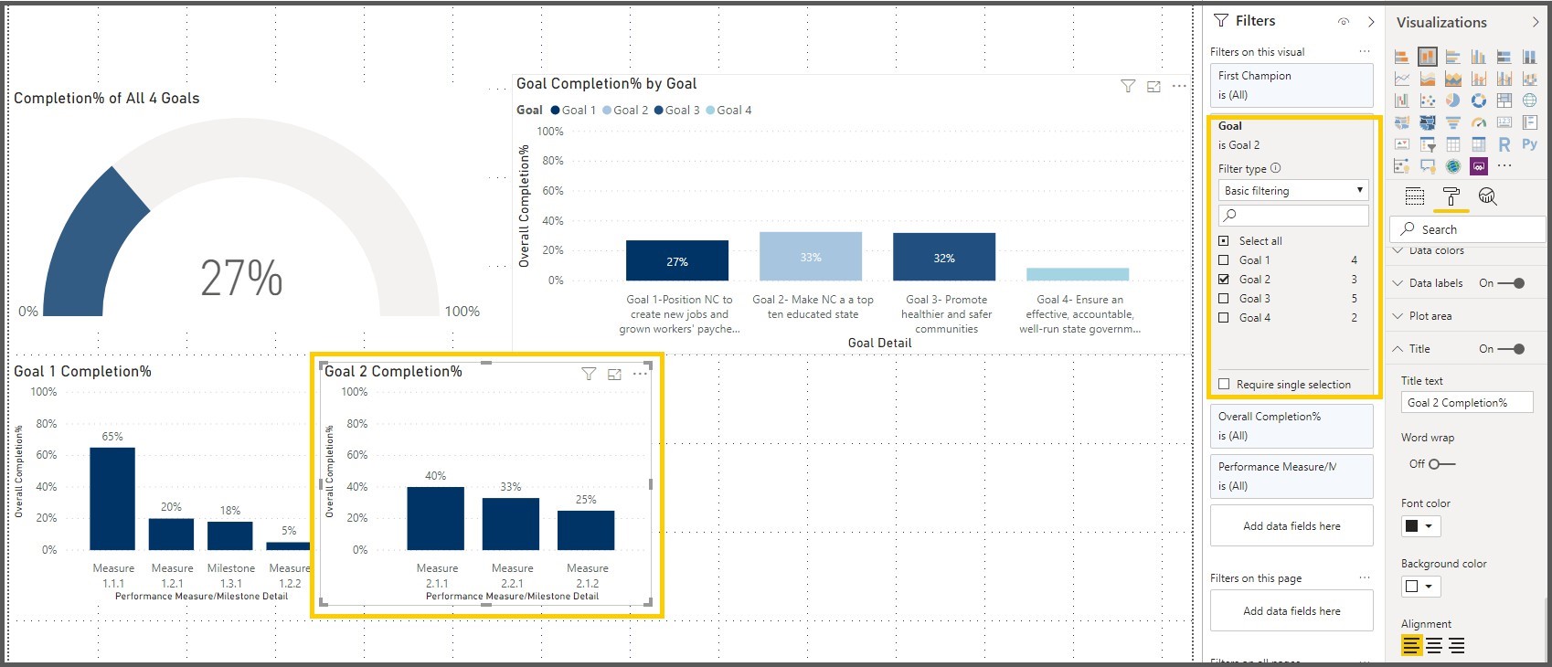
Notice that the Stacked Column Chart visual is automatically changed to the reflect the data to the Goal 2.
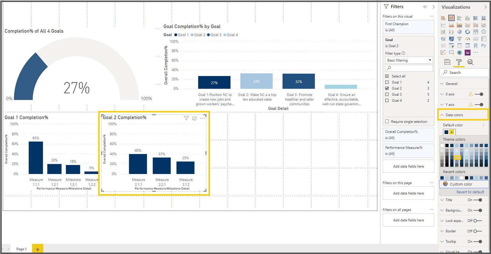
37. Click on the format icon () for the Stacked Column chart visual, expand Data colors property, Change the color to reflect the color for Goal 2 on the Goal Completion % by Goal.
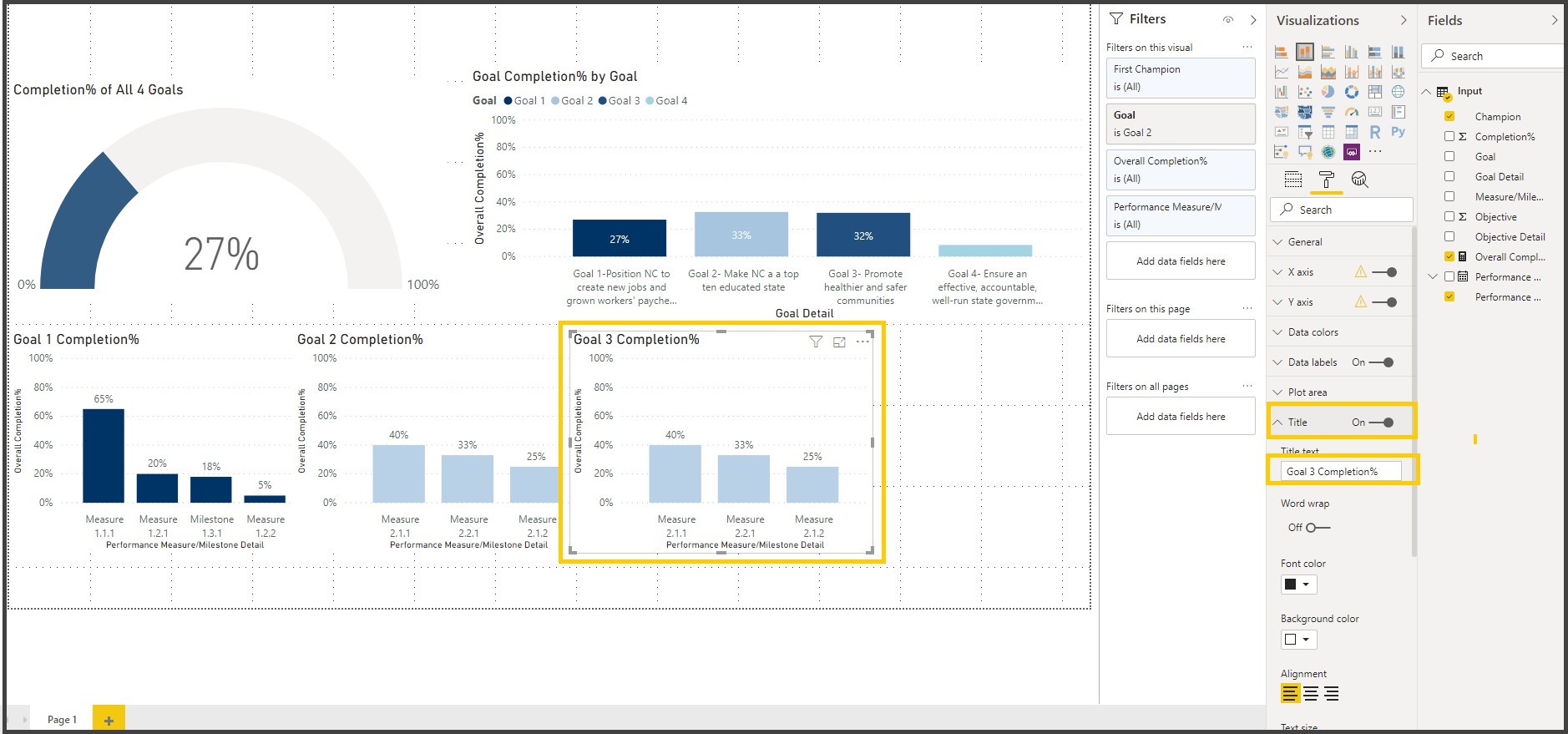
38. Click on the Stacked Column Chart visual and copy & paste it, Adjust the position on the Report page
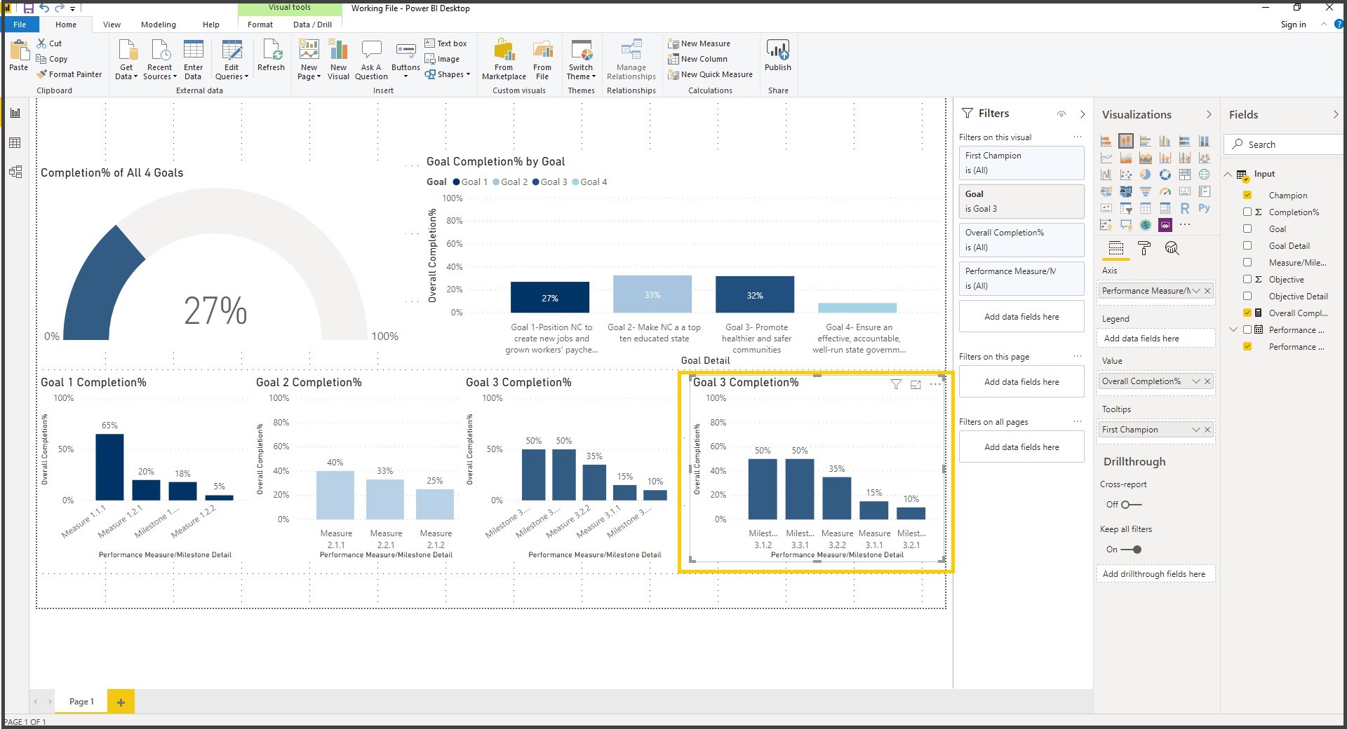
39. Click on the format icon () for the Stacked Column chart visual, expand Title and edit the title to Goal3 Completion %
40. Expand the filters pane, click on the drop down of the Goal Filter on Filters Pane and select Goal 3
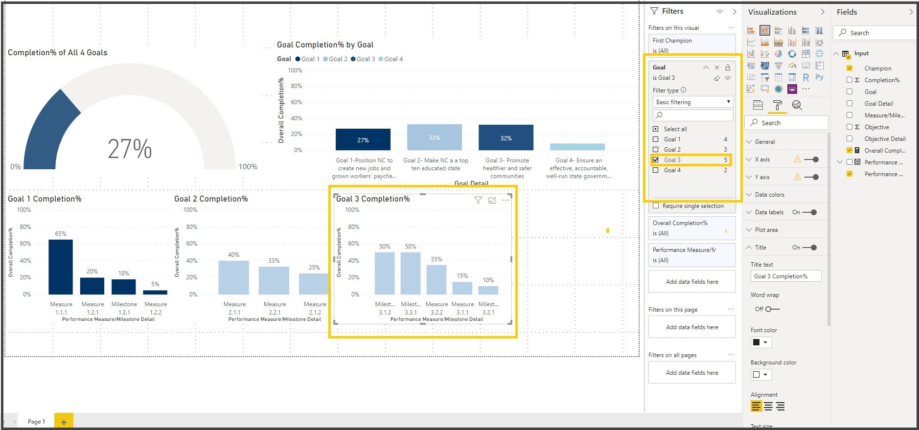
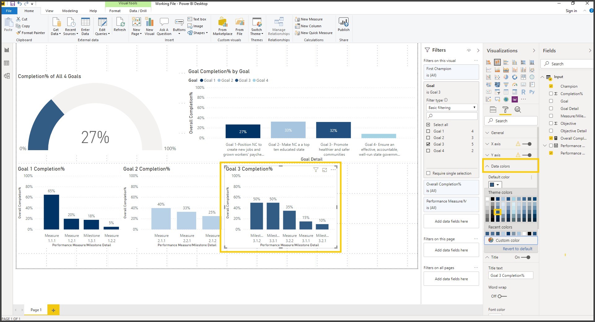
41. Click on the format icon () for the Stacked Column chart visual, expand Data colors property, Change the color to reflect the color for Goal 2 on the Goal Completion % by Goal.
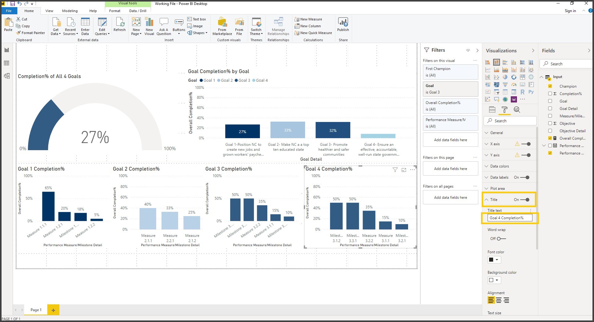
42. Click on the Stacked Column Chart visual and copy & paste it, Adjust the position on the Report page
43. Click on the format icon () for the Stacked Column chart visual, expand Title and edit the title to Goal3 Completion %
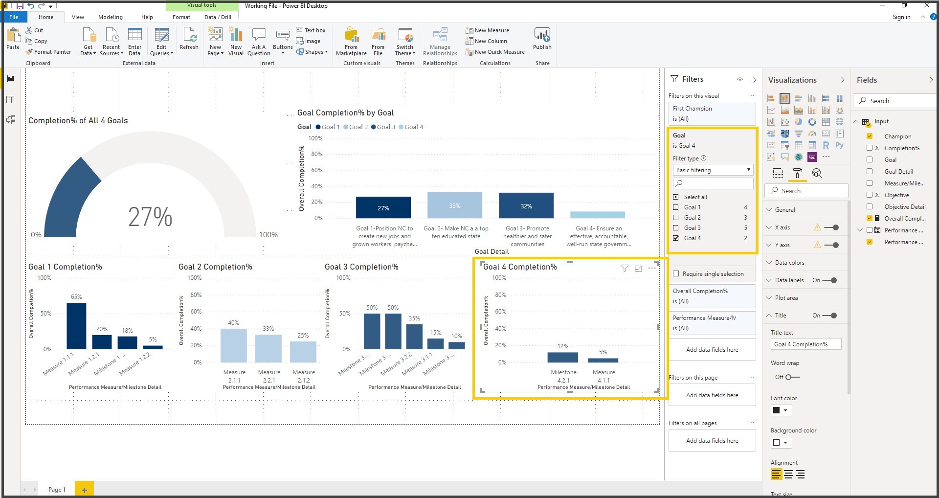
44. Expand the filters pane, click on the drop down of the Goal Filter on Filters Pane and select Goal 4
45. From the Home Ribbon, click on the Text Box and type in “Strategic Plan Dashboard” and increase the font size to 21.